Generate 17 color palettes from a single base color
Enter one base color, and the tool will generate 17 harmonious color palettes: monochromatic, complementary, triadic, tetradic, warm, cool, earth tones, neon, vintage, high contrast, sunset gradient and more. Each color can be copied with its HEX code.
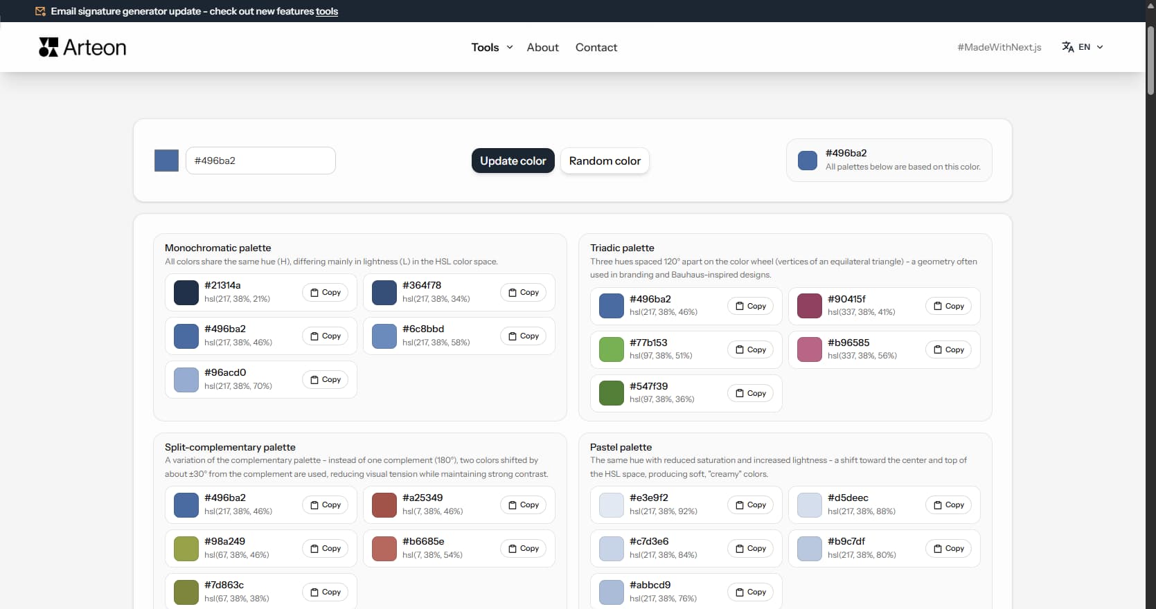
Monochromatic palette
All colors share the same hue (H), differing mainly in lightness (L) in the HSL color space.
#0b28ba
#153af2
#4f6bf5
#899cf8
#c3ccfc
Triadic palette
Three hues spaced 120° apart on the color wheel (vertices of an equilateral triangle) - a geometry often used in branding and Bauhaus-inspired designs.
#4f6bf5
#f43757
#7ff667
#f87f94
#42f21f
Split-complementary palette
A variation of the complementary palette - instead of one complement (180°), two colors shifted by about ±30° from the complement are used, reducing visual tension while maintaining strong contrast.
#4f6bf5
#f5864f
#bef54f
#f7a176
#b0f328
Pastel palette
The same hue with reduced saturation and increased lightness - a shift toward the center and top of the HSL space, producing soft, "creamy" colors.
#e1e5f4
#d3d7ee
#c4cae9
#b5bde3
#a6b0dd
Dark palette
The same hue with high saturation (S) and reduced lightness (L) - a downward shift on the lightness axis, producing deep colors typical of dark mode and bold accents.
#3757f4
#153af2
#0c2dd2
#0a25ab
#081d85
Tonal palette (Material Design inspired)
Several lightness steps of one hue - varied L and moderate S, similar to tonal ranges known from Material Design guidelines (e.g. 50-900).
#f2f3f8
#dcdfef
#b1bae7
#7c8ee9
#3e5df4
Minimalist palette (Apple inspired)
One bold color accent and several very light, soft neutrals - a layout typical of interfaces with plenty of white space and subtle shadows.
#3e5df4
#fafafa
#efeff1
#dfdfe2
#484951
Analogous palette
Colors with similar hues - from about -30° to +30° around the base color on the classic color wheel (e.g. Itten).
#4fbef5
#67a3f6
#4f6bf5
#4637f4
#864ff5
Complementary palette
The base color and its complement shifted by 180° on the color wheel - one of the fundamental color contrasts described by Johannes Itten.
#4f6bf5
#1f42f2
#f5d94f
#f8e37f
#f2cf1f
Tetradic (square) palette
Four hues spaced 90° apart on the color wheel (vertices of a square) - rich and balanced, ideal for complex UI themes and data visualization.
#4f6bf5
#f54fbe
#f5d94f
#4ff586
#97a8f9
Warm shift palette
Colors shifted toward the warm end of the spectrum (reds, oranges, yellows) - evokes energy, warmth, and approachability.
#f3d026
#e7f548
#c6f665
#e8e00d
#e5f886
Cool shift palette
Colors shifted toward the cool end of the spectrum (blues, teals, purples) - conveys calm, professionalism, and trust.
#0e34f1
#4434f3
#0c62d9
#565cf5
#0a3fb7
Earth tones palette
Low-saturation browns, olives, and ochres inspired by natural landscapes - perfect for organic brands, eco-friendly products, and rustic aesthetics.
#9b9b4b
#a3af6a
#88813a
#a6b686
#a5ac53
Neon vibrant palette
Maximum saturation colors with electric intensity - designed for bold marketing, gaming interfaces, and attention-grabbing designs.
#1a40ff
#330aff
#2994ff
#7f06f9
#15d4f9
Vintage muted palette
Desaturated, slightly warm tones reminiscent of aged prints and retro photography - ideal for heritage brands and nostalgic aesthetics.
#7c87c1
#9c8ac2
#69a2bf
#bc98c3
#65b3a6
High contrast palette
Extreme lightness range from near-black to near-white with the base hue - excellent for accessible designs and strong visual hierarchy.
#030a30
#081f91
#0e34f1
#869af8
#f3f4f6
Sunset gradient palette
A smooth hue rotation through warm to cool tones, mimicking a natural sunset - great for hero sections, backgrounds, and creative projects.
#2648f3
#6434f3
#a917f2
#e80dd6
#d90c73
Why generate a color palette?
A consistent color palette is the foundation of every visual project - from a website, through a logo, to printed materials. Manually selecting colors that work together requires knowledge of color theory. The generator does it automatically: you provide one base color (e.g., your logo color), and the tool creates 17 color sets based on proven color harmony schemes.
Each generated color comes with its HEX code (e.g., #496ba2) and HSL value (hue, saturation, lightness). The HEX code can be pasted directly into CSS, Figma, Canva, or any graphics application.
How to use the color palette generator
The whole process takes just a few seconds:
1. Enter the base color
Type a HEX code (e.g., #496ba2) in the text field or pick a color from the color picker. You can also use the Random Color button.2. Confirm your choice
After clicking the Update Color button, the tool will automatically generate 17 palettes based on different color harmony schemes.3. Copy the colors you need
Next to each color there is a Copy button - the HEX code goes to the clipboard and can be pasted directly into your project.
What color schemes does the tool generate?
The generator creates 17 palette types - each based on a different color theory principle:
Monochromatic palette
Several shades of one color - from light to dark. All colors have the same hue on the color wheel and differ only in lightness. Works well in elegant, minimalist designs where consistency matters.Analogous palette
Neighboring colors on the color wheel (shifted about 30° in both directions from the base). They create harmonious, smooth color transitions. Great for projects that build a warm or cool atmosphere.Complementary palette
The base color and the color opposite on the color wheel (180° shift). Creates strong visual contrast. Useful where an element needs to attract attention - buttons, highlighted headings, promo banners.Triadic palette
Three colors spaced 120° apart on the color wheel - forming an equilateral triangle. A vibrant, dynamic combination. Works well in creative projects: young brand identity, advertising materials, posters.Split-complementary palette
A softer version of the complementary palette. Instead of one opposite color, it uses two colors shifted about 30° from the complement. Gives clear contrast but without as strong visual tension.Pastel palette
The same hue with reduced saturation and increased lightness - soft, gentle colors. Popular in cosmetics, children's fashion, and food industry. Pairs well with a light background and white space.Dark palette
Base color at high saturation and reduced lightness - deep, intense colors. Useful for designing dark themes for websites and apps, as well as materials for premium brands.Tonal palette
Several lightness steps of one hue - from very light to dark. Similar to tonal scales used in design systems (e.g., shades from 50 to 900). Useful for building interfaces where the same color needs variants.Minimalist palette
One bold color accent and several very light, soft neutrals. The rest of the palette stays muted. Works well in modern interfaces with lots of white space - typical product and landing page style.Tetradic (square) palette
Four hues spaced 90° apart on the color wheel. Rich and balanced, ideal for complex UI themes, dashboards, and data visualization where you need multiple distinct colors.Warm shift palette
Colors shifted toward reds, oranges, and yellows. Evokes energy, warmth, and approachability. Great for food brands, hospitality, and energetic marketing campaigns.Cool shift palette
Colors shifted toward blues, teals, and purples. Conveys calm, professionalism, and trust. Popular in fintech, healthcare, and corporate branding.Earth tones palette
Low-saturation browns, olives, and ochres inspired by natural landscapes. Perfect for organic brands, eco-friendly products, craft businesses, and rustic aesthetics.Neon vibrant palette
Maximum saturation colors with electric intensity. Designed for bold marketing, gaming interfaces, nightlife brands, and attention-grabbing designs.Vintage muted palette
Desaturated, slightly warm tones reminiscent of aged prints and retro photography. Ideal for heritage brands, artisan products, and nostalgic aesthetics.High contrast palette
Extreme lightness range from near-black to near-white with the base hue. Excellent for accessible designs, strong visual hierarchy, and WCAG-compliant interfaces.Sunset gradient palette
A smooth hue rotation through warm to cool tones, mimicking a natural sunset. Great for hero sections, backgrounds, creative projects, and festival branding.
What is the color palette generator based on?
All palettes are created by mathematically transforming the base color in HSL color space. HSL describes a color with three values: hue (H) is the position on the color wheel (0°–360°), saturation (S) determines color intensity, and lightness (L) - how bright or dark the color is.
The complementary, triadic, and split-complementary palettes are based on color wheel geometry - colors are placed at equal angular intervals, creating visual balance. The monochromatic, pastel, and dark palettes change only lightness and saturation while keeping the same hue.
Where to use the generated color palettes
Brand visual identity
Select complementary colors for an existing logo or build a branding palette from scratch - for business cards, stationery, and marketing materials.Websites
Establish the primary color, accent color, and background shades. Copied HEX codes paste straight into CSS stylesheets or theme configuration.App interfaces
The tonal palette provides lightness variants of one color - lighter for backgrounds, darker for text, intermediate for borders and interactive states.Social media graphics
Consistent colors for posts, stories, and profile covers. Analogous or pastel palettes work well when you want a uniform, recognizable style.Presentations and documents
Harmonious color sets for slides, charts, and infographics. Monochromatic or minimalist palettes maintain visual order.
Color psychology in design: what colors communicate
Color choices influence how visitors perceive a brand or product. Research in marketing and UX consistently shows measurable effects:
- Red - urgency, appetite, energy. Common in food delivery, sale banners, and emergency alerts.
- Blue - trust, stability, professionalism. Dominant in finance, healthcare, and corporate software.
- Green - nature, health, growth. Used by organic brands, environmental organizations, and wellness apps.
- Yellow / Orange - optimism, warmth, attention. Effective for call-to-action elements and promotional highlights.
- Black / Dark gray - luxury, sophistication, authority. Standard for premium fashion, automotive, and high-end technology.
- Purple - creativity, wisdom, premium quality. Appears in education platforms, beauty products, and spiritual wellness.
Color temperature also shapes perception. Warm hues (red, orange, yellow) feel energetic and inviting. Cool hues (blue, green, violet) feel calm and professional. Neutral tones (gray, beige, taupe) recede into the background and let accent colors stand out. A well-balanced palette mixes warm and cool tones to guide attention without overwhelming the viewer.
These associations vary by culture and context. In Western markets, white signals purity and minimalism. In several East Asian cultures, white is associated with mourning. Red means luck and prosperity in China but danger in many European countries. Always research local color perception before finalizing a global brand palette.
Choosing palette colors for accessibility
A beautiful palette means nothing if users cannot read the text. When selecting colors from any generated scheme, keep these accessibility principles in mind:
- Test contrast ratios - use a contrast checker to verify that text colors meet WCAG 2.1 AA (4.5:1 for body text, 3:1 for large text and UI elements).
- Avoid color-only information - do not rely solely on color to convey meaning. Pair colors with icons, labels, or patterns.
- The high-contrast palette is WCAG-ready - it maximizes the lightness range and is designed specifically for accessible interfaces.
- Check light and dark modes - a color that works on white may fail on dark backgrounds. Test both.
About 8% of men and 0.5% of women have some form of color vision deficiency. The most common type is red-green (deuteranopia and protanopia), which makes red and green look similar. Avoid pairing these two colors as the only way to distinguish elements. Blue-yellow colorblindness (tritanopia) is rarer but still affects palette choices. Simulate how your color scheme looks under different vision types before shipping a design.
Accessible palettes benefit everyone, not just users with disabilities. High contrast improves readability in bright sunlight, on low-quality screens, and for aging eyes. Treating accessibility as a baseline rather than an afterthought produces better color systems overall.
Print vs screen: RGB, CMYK, and Pantone
The HEX codes generated by this tool are designed for screens (RGB color model). If you plan to use the palette in print materials, be aware of key differences:
- RGB → CMYK conversion - printers use cyan, magenta, yellow, and black inks. Some bright RGB colors (especially vivid blues and greens) cannot be reproduced exactly in CMYK. Always preview a CMYK proof before printing.
- Pantone spot colors - for brand consistency across different printers and materials, consider matching your HEX palette to Pantone references. Pantone provides precise ink formulas that produce consistent results.
- Paper affects color - the same ink looks different on coated vs uncoated paper. Glossy stock produces brighter colors; matte stock absorbs more ink and appears softer.
The gap between screen and print colors is called the gamut difference. RGB screens can display roughly 16.7 million colors. CMYK printing reproduces a smaller range. Neon greens, electric blues, and saturated magentas often shift noticeably when printed. A practical workflow is to generate your palette here, then open the HEX values in a design tool with soft-proofing enabled to preview the CMYK result before sending files to a printer.
Color in digital design systems
Modern products use design tokens to manage color at scale. A design token is a named value - for example, color-primary-500 - that maps to a specific HEX code. Tokens make it easy to update a brand palette across an entire application by changing one value instead of hundreds of individual color references.
The tonal palette from this generator maps directly to this approach. It produces a lightness scale from a single base hue: the darkest shade works as 900, the lightest as 50, and intermediate steps fill the range between them. Copy these HEX values into your token file and you have an instant, balanced color ramp.
Design systems like Material Design 3 and Apple Human Interface Guidelines build their color logic on similar tonal scales. Semantic tokens add another layer: color-error, color-success, color-warning reference specific palette slots. Generate a complementary or triadic palette to find distinct hues for each semantic role, then build tonal scales for each.
How color names differ across languages and cultures
Languages divide the color spectrum differently. Russian has separate basic words for light blue (goluboy) and dark blue (siniy), while English groups both under one term. Japanese traditionally distinguishes blue and green less sharply - the word ao can mean either depending on context. These linguistic boundaries shape how people perceive and remember colors.
Marketing research shows that color names affect purchase decisions. A paint called "alpine snow" outsells the same white labeled "plain white." Descriptive, evocative names add perceived value. When building a brand palette, consider how each color will be named in your target markets. A shade that sounds elegant in English may need a completely different name in another language.
Industry standards try to bridge this gap. Pantone assigns numeric codes that work worldwide. RAL, popular in Europe, uses a four-digit system. NCS (Natural Color System), developed in Scandinavia, describes colors by how the human eye perceives them rather than how screens or printers reproduce them. Knowing which system your audience uses helps you communicate color choices clearly across teams and suppliers.
Troubleshooting the palette generator
Palettes don't change after entering a color
Simply typing a HEX code does not automatically generate palettes - you need to confirm the change with the Update Color button. Only after confirmation does the tool recalculate all 17 schemes.Invalid format message
The generator only accepts HEX format with a # at the beginning, e.g., #FF5500. Formats without # (e.g., FF5500) or in RGB notation (e.g., rgb(255,85,0)) are not supported.Short and full HEX format
Both formats are supported: full #RRGGBB (e.g., #FF5500) and short #RGB (e.g., #F50). The generator automatically recognizes both and treats them identically.
Frequently asked questions about the color palette generator
What format should the base color be in?
The generator accepts colors in HEX format - both short (e.g., #F50) and full (e.g., #FF5500). Next to the text field you will find a color picker that lets you choose a color visually. Generated palettes show the HEX code and HSL value of each color.
How many colors does each palette contain?
Each palette contains 4 to 6 colors. The number depends on the scheme type - monochromatic and tonal palettes generate more shades (a lightness scale of one hue), while complementary and triadic palettes focus on fewer contrasting colors.
What is the HSL color space and how to read it?
HSL is a way of describing color using three values: H (hue, 0°–360° on the color wheel), S (saturation, 0%–100%), and L (lightness, 0%–100%). The generator displays HSL values alongside each color, making it easier to understand how the colors in the palette differ - e.g., a monochromatic palette changes only lightness (L) while keeping the same hue (H).
Can I use the generated palettes commercially?
Yes. You can use the generated color palettes in any project - commercial and non-commercial, without licensing restrictions.
Does the color palette generator require login or payment?
The generator is completely free and requires no login or registration. Colors are generated locally in the browser - no data is sent to external servers.
What is the difference between complementary and split-complementary?
A complementary palette pairs the base color with its exact opposite on the color wheel (180° apart). A split-complementary palette replaces the direct opposite with its two neighbors - producing a similar contrast effect but with more variety and a less aggressive visual tension.
Which palette type is best for a professional corporate website?
Monochromatic or tonal palettes work well for corporate sites because they provide a unified, calm visual hierarchy. Use the tonal palette to build a complete system of background, text, border, and accent shades from a single brand color. Pair with the high-contrast palette if accessibility is a priority.
Can I convert the generated HEX codes to RGB or HSL?
The tool displays both the HEX code and the HSL value for every generated color. To convert to RGB, you can use any browser developer tools - enter the HEX code in the color picker and the RGB value is shown automatically.
How do I build a dark mode palette from these colors?
Start with the tonal palette of your brand color. Use the darkest shades (low lightness values) as backgrounds and the lightest shades as text. Then check every text-background combination with a contrast checker to ensure WCAG AA compliance (4.5:1 for body text).
What are earth tone palettes used for?
Earth tone palettes contain desaturated browns, olives, and ochres inspired by natural landscapes. They are commonly used by organic food brands, eco-friendly products, artisan businesses, outdoor and travel companies, and interior design. These warm, muted colors convey authenticity and a connection to nature.
Help us improve our tools
Have an idea for a new feature, found a bug, or want to suggest another tool that would make your work easier? Write to us – we respond within 24 hours.
Explore other useful tools
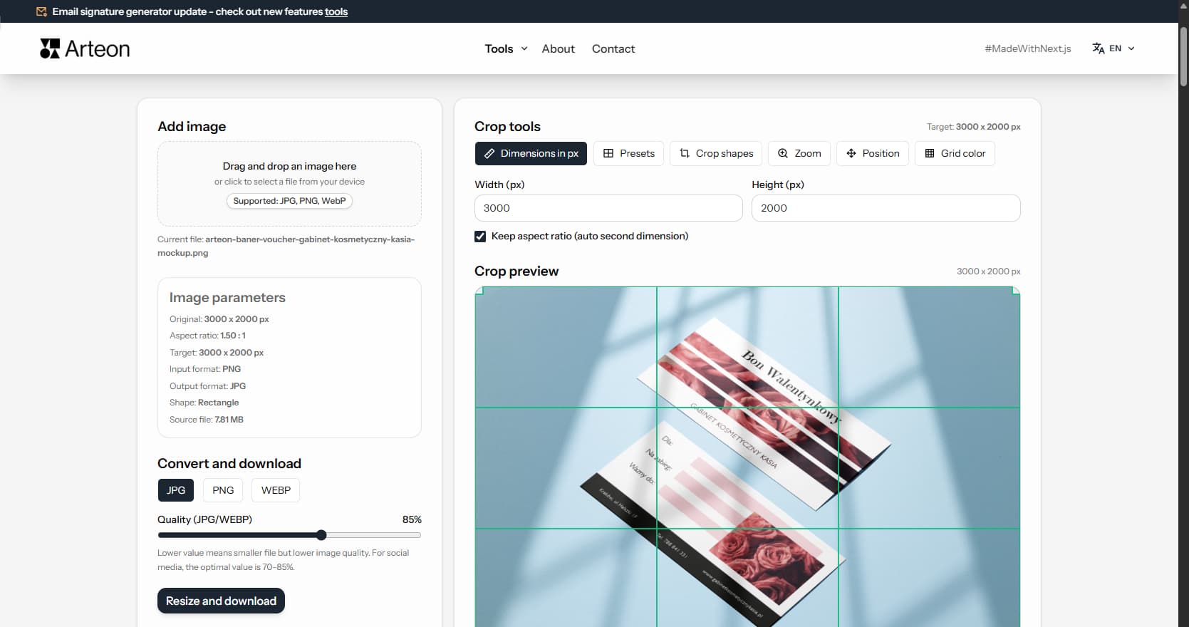
Online image editor
Resize, crop and convert your image. Ready-made formats for social media, circular avatars, export to JPG/PNG/WebP.
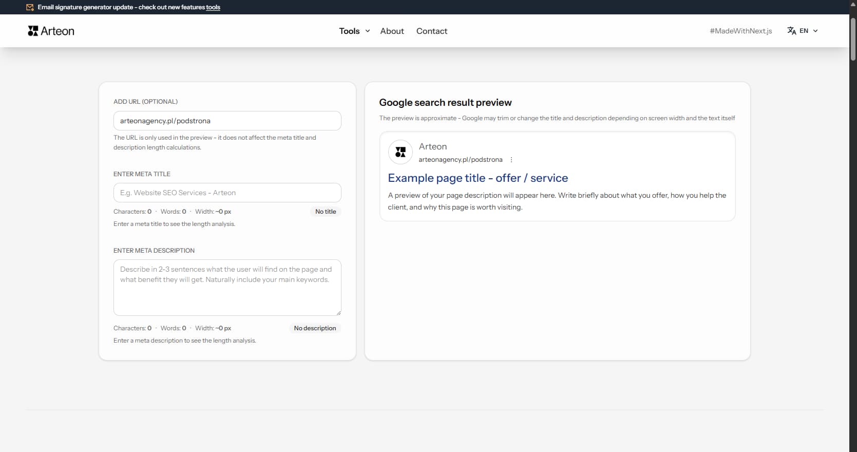
Meta title & description checker
Check title and description length in pixels. Live Google preview and optimization tips.
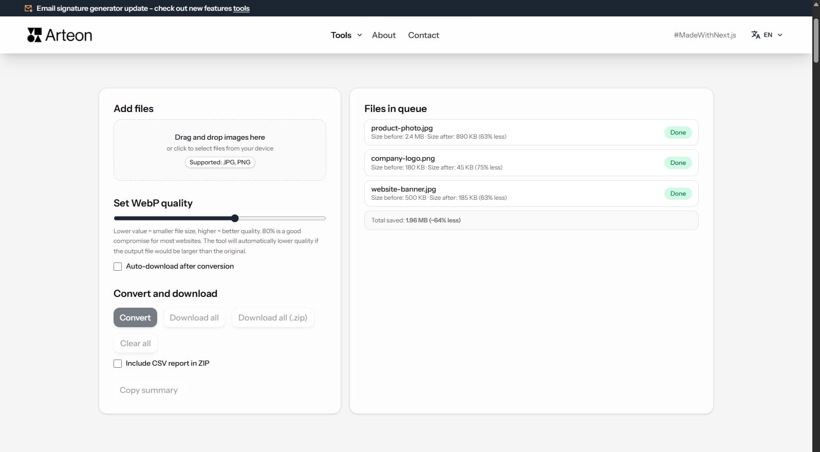
PNG to JPG
Convert PNG files to JPG in your browser. No file limits, no signup, no server uploads.
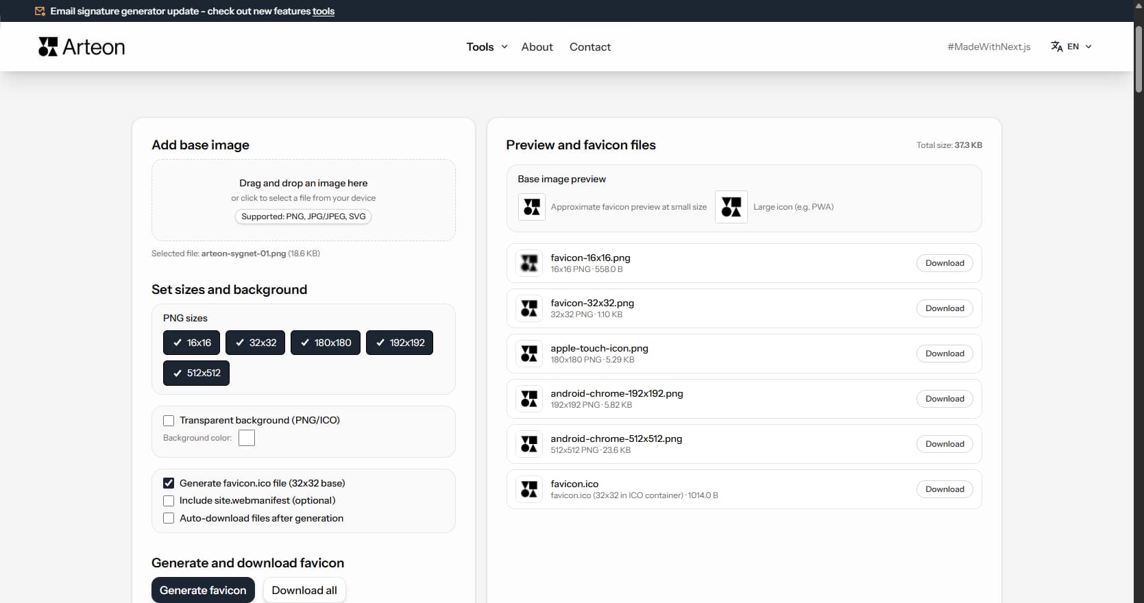
Favicon generator
Create a complete favicon.ico set for your website from one image. All required sizes, no login.
Color palette generator
Generate 9 palettes from one color: monochromatic, complementary, triadic and more. HEX codes.
WebP to JPG
Convert WebP files to universally compatible JPG. Works in every app and platform.
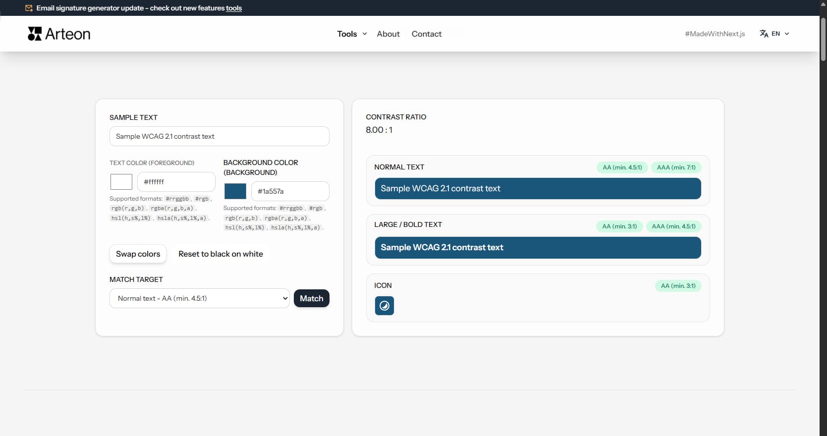
Color contrast checker
Check text and background contrast per WCAG 2.1 AA and AAA. Automatic color correction.
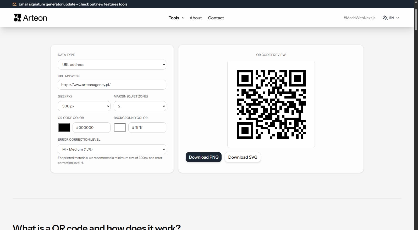
Free QR code generator
Create a QR code for a website, vCard business card or print. Export PNG and SVG, no registration.
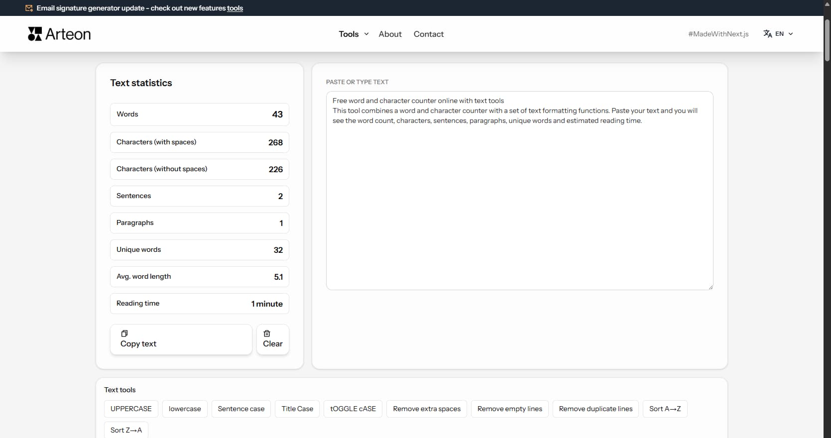
Word & character counter
Count words, characters, sentences and reading time. Check readability with the Flesch-Kincaid score.